
The duck is growing
A 2024 update on the hourly shape of the electricity prices in Europe.

With over 7,500 free subscribers, I feel encouraged that my work is appreciated. Writing an article, including all data analysis, requires a considerable amount of time.
Thanks for showing me your support.
Last year, I published a post on the arrival of the duck curves in Europe. Unsurprisingly, the duck has grown significantly in 2024, and it may now be closer to a “canyon curve” than a duck curve. Let’s check it together.
Evolution of the normalized prices
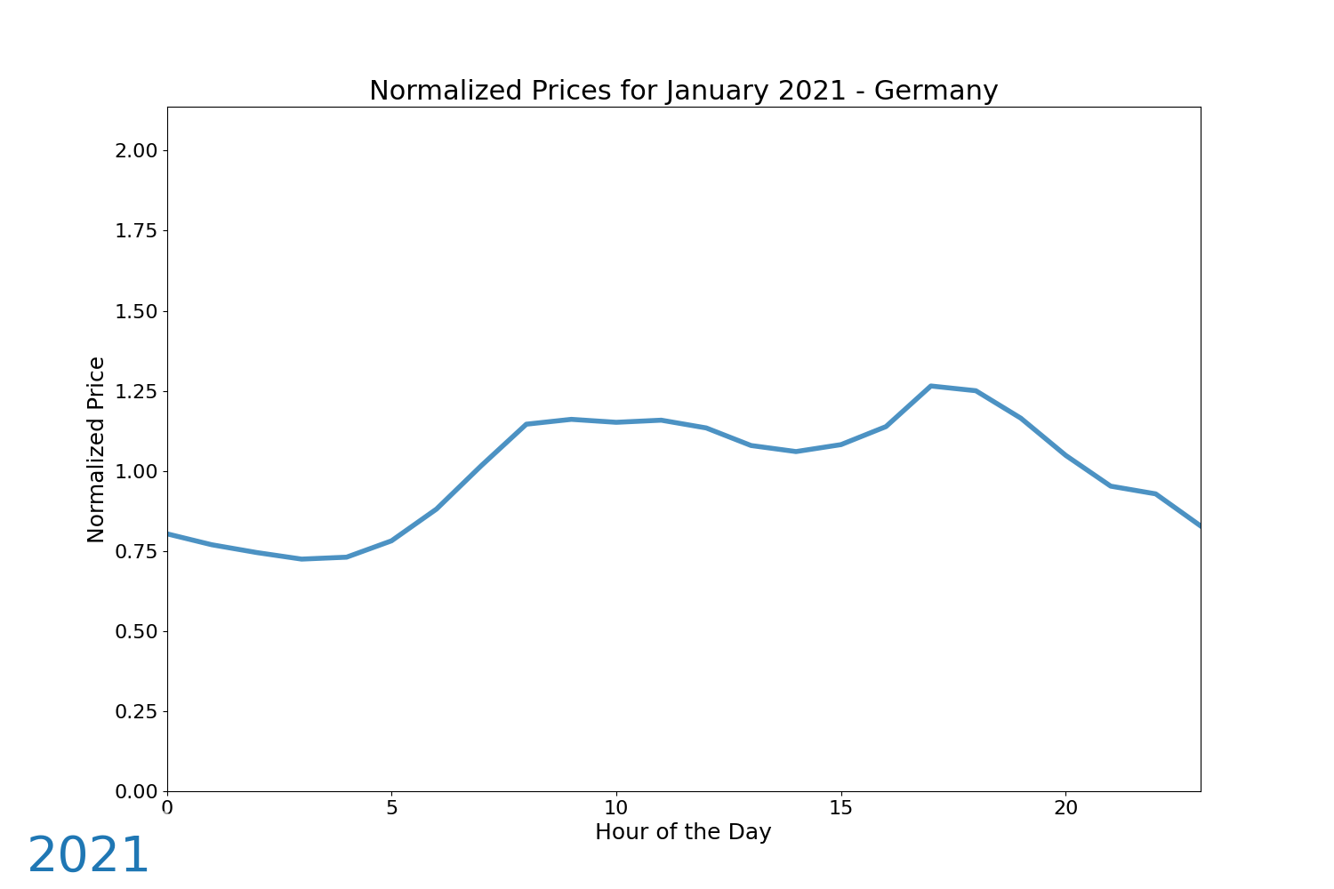
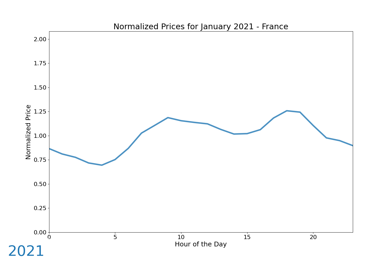
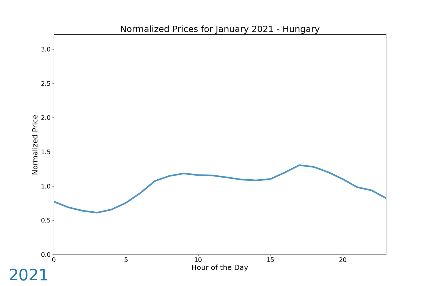
Here are some animations depicting the evolution of normalized day-ahead prices, averaged on a monthly basis. The normalization process involves dividing each data point by the monthly average across all hours, ensuring the curves remain centered around an average value of 1. This method highlights the shape of the curves without reflecting the absolute price levels, which were significantly higher during the peak of the energy crisis in 2022. Consequently, this allows for a year-over-year comparison.
The first animation is on Germany.
Then, France, even though it has a limited solar capacity for its size, is facing a similar phenomena.
And here for Hungary, which is the leading European country in terms of electricity share in its generation mix. We can also observe the recent evening peaks for Hungary, not directly linked to solar of course.
Focus on Germany
Focusing on Germany, hereunder is the graph for the normalized prices averaged over the full year. On average, peak hours are around twice more expensive than afternoon hours. This probably should make us relativize on the notion of peak prices in the power markets, generally considered between 8 AM and 8 PM.

Focusing specifically on the solar season, defined here as the six months from April to September, the impact becomes much clearer. Afternoon prices are, on average, roughly one-third of the overall average price, while peak hour prices reach 175% of the average price. The year 2024 has been distinctly more pronounced in these trends compared to 2023.

Comparison with neighboring countries
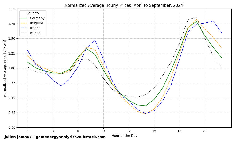
As the European grid is interconnected and as the solar capacity is growing in all countries, the curve is being shaped on a similar fashion. Hereunder are the same graphs as above, but for the year 2024 and in comparison with three neighboring countries: Belgium, France, and Poland.

Poland seems to be slightly less impacted, while France and Belgium have been slightly more marked, with the price at 2 PM reaching 25% of the average (of 7 times cheaper than the peak hour on average).
Captured prices vs PPA prices
With these types of price curves, one might wonder about the willingness to continue building more solar capacity. The graph below, from S&P Global Commodity Insights, displays "Break-even estimates for 10-year PPAs starting in 2026." This can be interpreted as the average forecasted price for a pay-as-produced PPA from 2026 to 2035, aimed at covering the costs associated with new construction, operation, and financing.

As observed, there are considerable variations in solar prices, ranging from 38 €/MWh in Spain to 115 €/MWh in Finland, reflecting differences in sunlight availability. Wind energy prices are more consistent, ranging between 60 and 80 €/MWh. My intention is not to challenge the accuracy of these figures but to consider how they compare to the capture prices for solar energy.
In 2024, the capture prices were 42 €/MWh in Spain, 47 €/MWh in Germany, and 39 €/MWh in France. This indicates that capture prices in France and Germany were already significantly lower. The key questions to consider are:
Will the solar capture prices continue their downward trend? Given the current expansion plans, it seems likely to me that they will.
Will increased consumption and storage provide enough compensation and relief?
Will there still be strong demand for additional solar capacity, both through corporate PPAs and government-backed support mechanisms, such as Contracts-for-Difference1?
As shown in the graph below, the installed solar capacity in the EU zone was higher in 2024 compared to 2023. However, it is evident that the rate of acceleration has notably slowed, as the added capacity in 2024 was only slightly above the one of 2023. Of course, adding more than 60 GW is substantial by itself, as the consumption is around 250 GW to 300 GW in the EU.

The daily spreads: a case for batteries?
The duck curves also provide a valuable perspective for investigating spreads in the day-ahead markets. In the graph below, we can observe the evolution of the daily spread, defined as the difference between the maximum and minimum daily prices. For the year 2024, the average daily spread remains below 100 €/MWh, indicating that a 1 MWh cycle per day, with perfect forecasting and no losses, would generate less than 40 k€/year.
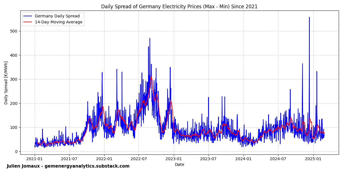
Below is a graph showing the 4-week rolling average of the spread divided by the 4-week rolling average of the average price.

There are a few notable observations:
The highest spreads were achieved during the energy crisis, attributed to significantly higher average prices. However, relative spreads were lower.
In 2024, the spreads have been substantial, exceeding 100% of the average prices for most of the solar season. This means that if the average price is around 70 €/MWh, the spread surpasses that level.
The largest daily spreads have been observed recently, as discussed in my previous post on the Dunkelflaute.
These daily spreads are a direct consequence of the rise in solar energy. A clear solution is to install more batteries, which can capitalize on these spreads. While these spreads in the day-ahead markets suggest a potentially profitable business case, it's uncertain whether they are currently sufficient to justify the investment fully. Furthermore, significant opportunities and volumes remain for batteries in short-term flexibility, particularly in balancing markets and intraday markets, before considering batteries primarily for profiting from day-ahead market spreads. Nevertheless, this time may arrive as the learning curve for batteries continues to develop, and daily spreads are likely to grow.
Interestingly, on the other side, once batteries become well-integrated into day-ahead markets, it implies that other avenues of remuneration, such as balancing markets and intraday opportunities, may have significantly reduced to align with day-ahead market spreads2.
Thanks for reading, Julien.
PS: if you are a business interested in supporting my work, please consider a group subscription.