The Emergence of Duck Curves in Europe
A short analysis of the impact of solar in Europe over the past three years.
In this post, I'll be unveiling graphs depicting the evolution of power prices across various European countries over the past three years. Rather than fixating on absolute values, I'll delve into the shapes of the curves, facilitated by a normalization process1. Of particular significance is the notable progression of the "duck curves" within European markets, attributed to the growing penetration of solar energy.
Let’s discover that topic together.
The solar boom in Europe
Two reports underscore the remarkable surge of solar energy in Europe. The first, compiled by SolarPower Europe, delves into the outlook of the solar industry in the EU from 2023 to 2027. Their analysis reveals that the installed solar capacity stood at 263 GWdc2 by the close of 2023. According to their medium scenario, this capacity is projected to more than double over the next four years, soaring to 576 GWdc. To contextualize this expansion, consider that the total electricity demand in the EU for 2023 was 2700 TWh, equating to an average load of 308 GW. By the end of 2024, the installed solar capacity is anticipated to surpass this average load, nearing double by the end of 2027.
Another interesting report comes from Ember, offering insights into the electricity sector for the year 2023. One particularly captivating graph depicts the share of generation from fossil fuels for each hour of the year. Notably, a distinct pattern emerges showcasing the prominence of solar energy during the afternoon hours from March to October (orange rectangle below).
This pattern is then directly translated into electricity prices. Hereunder is the representation of the average day-ahead prices3 in Germany in 2023.
The normalization of power prices
In this post, I will show the prices after normalization. Given the significant fluctuations in power prices over recent years due to the energy crisis, comparing them solely based on absolute values (in €/MWh) would be difficult. To address this, I've normalized power prices on an annual level by calculating hourly averages (365 data points for one year). This entails dividing each hourly average by the annual average, yielding a value that represents the percentage of the hourly price compared to the yearly average. A similar methodology is applied for shorter periods such as one month. This normalization allows for a more meaningful comparison of power prices across different years.
The European tour - yearly production
We select four different countries that are located in different regions and which do not share any border: Greece, Germany, Spain, and Serbia.
First, we start with Greece, which is the 2023 leader in terms of solar energy share in its electricity mix. We observe that the lowest value happens at 1 PM (0.72) while the highest value is at 7 PM (1.44). As we can see, the cheapest hours were during the afternoon in 2023, while it was during the night in 2021.
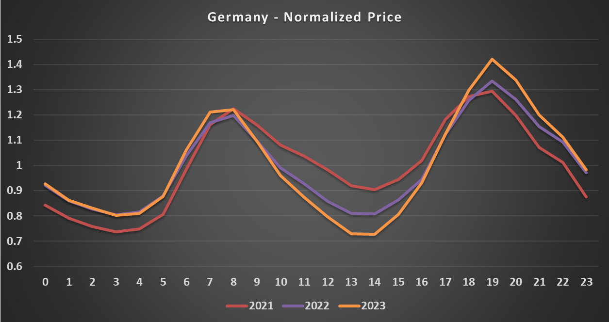
Now, let’s consider Germany. Similarly to Greece, the difference between the average price at 1 PM and the average price at 7 PM is almost double (0.73 to 1.42). And the cheapest hours happen as well during the afternoon in 2023.
And here is Spain. We can observe that the low prices during the afternoon are larger than for the other countries, as well as the difference between the nighttime and these afternoon hours.
And finally, we move to Serbia, a country that is not at the forefront for solar but still, we can observe a large impact happening, especially in 2023. This shows that electricity markets are interconnected and influence each other, even if the country is not part of the EU.
What about particular moments?
If we zoom in on particular months, we obtain different results. Hereunder are the results for Spain for March and April. I selected these months because the baseload prices on EEX have been particularly low in February (closing at 35 €/MWh for both months on 20 February 2024). Last year, the average price at 3 PM on these two months was 50% of the baseload price and three times less than the most expensive hours (8 and 9 PM). It highlights the increased volatility, especially when renewable generation is substantial and demand is limited.
Europe is not alone. A look at Australia
While precise forecasting remains elusive, there's a growing consensus on the escalating influence of solar energy in our energy markets. Australia has zonal pricing akin to Europe and is positioned at the forefront of the solar revolution, which offers a compelling case study.
In the latest Quarterly Energy Dynamics report, notable developments are outlined, particularly regarding price dynamics in select regions during specific hours. A striking observation emerges: on average, prices have dipped into negative territory4 in Victoria during the afternoon hours in Q4-2023.
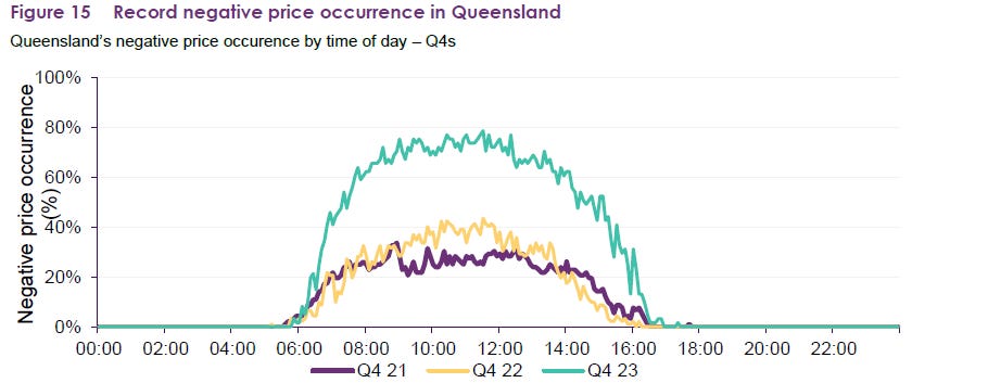
Examining Queensland, another region in Australia, reveals a similar trend of heightened solar influence. Notably, the occurrence of negative prices exceeded 60% of the time during the afternoon hours in Q4 2023, marking a significant increase compared to previous quarters.
In conclusion
Solar is going to have a large impact on the European power systems. Every year, we will probably witness its increasing influence, especially on electricity prices. This will have various consequences that I try to capture in my Substack. See for example:
An improved way to support renewables: the financial CfD.
Let’s see how this year 2024 will be but I am convinced that the impact can only be greater.
As you all know, the absolute values went really high during the energy crisis, especially in 2022.
DC values mean the capacity of installed modules. AC values are generally lower. For example, REPowerEU has a target of 750 GWdc and 600 GWac for the EU by 2030.
Each box is an average of 7 data points. There are 1248 boxes in total. Only the last day of the year is missing as it is in week 53, not shown.
Renewables often bid with a negative marginal cost in Australia as they receive a kind of market premium called a Large-scale generation certificate.


Brilliant analysis! Thx!
As always, great and thanks for sharing Julien