I recently created two different graphs illustrating the declining market value of renewables, which have generated significant reactions on LinkedIn (see here and here). Given the unexpectedly high reaction, I am writing a longer post to explore this important topic.
The different flavors of value
Before going into the graphs, it is important to define what we are examining. In the graphs, I refer to market value, which is defined as the generation at a specific moment multiplied by the market price at that moment. As the cornerstone of European markets is the hourly price of the day-ahead markets, the market value is simply the product of the generation and this hourly price.
Since the market price is determined by the marginal buyer (and seller), it reflects the price at which the bid curve intersects the supply curve—beyond this price, buyers are not willing to pay for what suppliers are offering. Nevertheless, all selected buyers, except the marginal one, will receive electricity that is cheaper than what they were willing to pay for.
Moreover, electricity (and energy in general) is fundamentally more valuable than the price we pay. Even though we might think our energy bill is too high, what would we actually do in modern society without electricity1? So, it is not because the market price is zero that there is no value in the produced electricity. What is true, however, is that increasing generation for the hours when the price is low only brings a lower incremental value.
Average market value in function of generation output
The first graph is the average market value of wind and solar in function of their generation output in 2024 in Germany. As of today, Germany has more than 90 GW of solar and more than 70 GW of wind (onshore and offshore combined)2. This graph shows the average market value for a particular level of penetration3. For comparison, a green line is drawn indicating what the market value would be if the captured market price was constant and equal to the annual average day-ahead price in 2024, which is currently 71 €/MWh.
We can observe that for low-generation output (within the red rectangle), wind and solar are very close to the green line. This suggests that at such levels of penetration (up to 15/20 GW), solar and wind do not significantly influence the market price and are effectively price takers. Beyond this point, the average market value tends to deviate from the green line, indicating that increased generation begins to impact the market price4.
In addition to this simple observation, we can also note that solar appears to be more affected than wind at similar generation outputs. There are several potential explanations for this.
First, in this part of the world, wind tends to be stronger in winter when demand—and consequently market prices—are higher.
Second, there is greater geographical dispersion for wind generation compared to solar, which means higher wind generation can be exported at higher market values.
Third, in Germany, wind tends to be more responsive to market prices than solar, leading to economic curtailment. Since we are examining actual generation rather than potential generation, this economic curtailment for wind increases its average market value.
Feel free to leave a comment if you have other reasons in mind.
Max solar generation is different from max market value
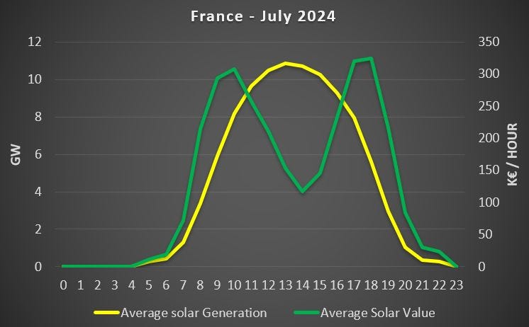
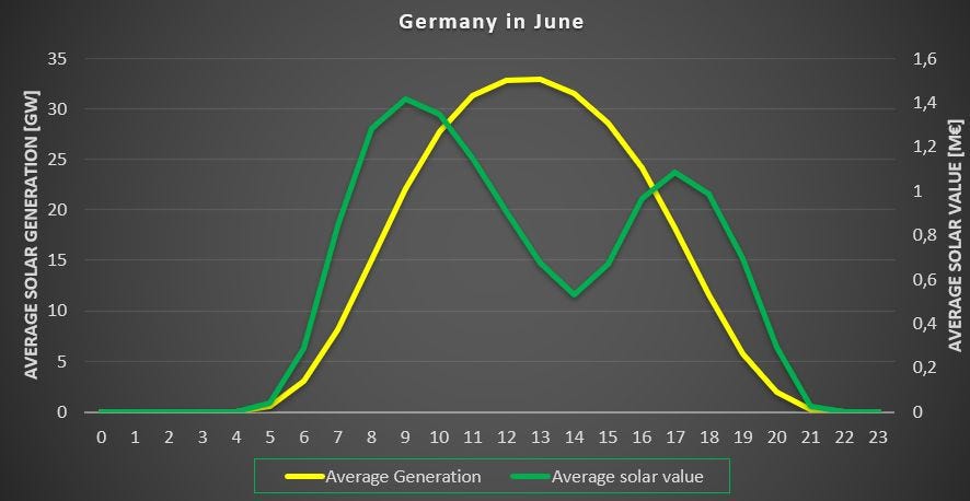
The following graphs focus on solar generation in specific months. Each graph presents the average market value of solar per hour (green line) compared to the average solar generation per hour (yellow line). The first graph represents France in July 2024, while the second one represents Germany in June 2024. Creating similar graphs for wind per hour is less meaningful, as wind generation does not exhibit the repetitive daily pattern characteristic of solar.
The difference between the two curves is striking. Even in France, which has a much lower installed solar capacity, the disparity between market value and actual generation is significant. This graph also highlights why vertically oriented solar panels with an East-West orientation could be an interesting solution to maximize value5.
A final graph - from duckling to adult duck
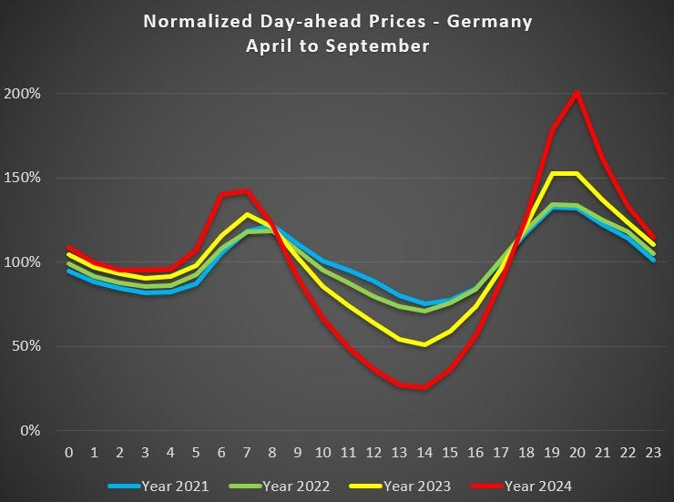
To conclude this post, here is the updated graph presenting the normalized day-ahead prices for the "solar months" (April to September). This graph clearly illustrates the significant impact that solar generation has on market prices, offering a clear explanation for the observations in the previous graphs.
It is remarkable to see the widening differences between the extremes. While in 2021 and 2022, the average price at 2 PM was above 70% of the overall average hourly price, it dropped to 54% in 2023 and even 26% in 2024. Meanwhile, the average price at 8 PM was only about one-third higher in 2021 and 2022 but more than doubled by 2024.
This trend of decreasing market prices is likely to continue in the coming years if the installation rate of renewables, especially solar, continues to outpace other factors that might stabilize or mitigate this drop in market value6. In fact, this drop in market value could potentially be the greatest limiting factor for the continuous increase of renewable energy sources.7.
For more insights on the market value of solar (and renewables), I suggest that you consult the following previous posts:
Thanks for reading. Do not hesitate to reach out to me and to share this Substack.
See for example concepts like the Value of Loss Load.
For example, the average market value for 15 GW of solar is calculated by averaging the solar market value of all hours with a solar generation at 15 GW.
The more chaotic behavior of the curves for larger generation output is because there are fewer data points.
See my earlier post on vertical solar.
In fine, these elements revolve mostly around boosting demand when renewables generation is high, either by creating new demand (Electric Vehicles, heat pumps, etc.) or by switching existing demand from one hour to another (flexibility, storage).
See my previous post: Limits to growth: solar edition.


A 4th reason could be the impact that domestic solar has on commercial solar. As domestic solar continues its inevitable increase the value that commercial solar offers inevitibly declines.
Commercial wind does not compete with domestic wind, as domestic wind simply does not work.
In terms of the numbers - little to disagree with. However, the narrative focuses on "value" (and declining value for RES/PV) but circles around the reason for that - surplus elec looking for a home. The current mainstream narrative (fantasy?) is that "markets'll fix it" - which of course they won/'t/can't & at the risk of sounding like a broken record - markets functionally can only "do" cost optimisation - that's all (as any macro economist will tell you). Missing is storage - again, market fantasists think that "price signals" will do the trick. The charts suggest otherwise. All of this was obvious years back - e.g. look at charts for Spain - try 2019 vs 2020 for a view of a price collapsing future for RES MWh (due to rising RES and falling demand due to Covid). Repeating: what is needed is a policy that mandates the build out of storage to match RES development. Batts don't scale, electrolysers/H2 does. You could also throw in air-con with cold storage for hot & sunny regions (thus attacking the duck curve). None of this is hard - begging the question: why is it not being done?